In a highly digital world, is there still room for the humble print advertisement? Our creative team think so. We put together a list of our favourites, showcasing how brands can still make an impact with ink on paper…
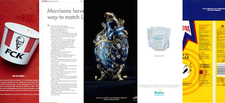
KFC say ‘FCK’ after nationwide chicken shortage
Back in February, fast food chain KFC were left red-faced after a courier issue in the UK meant that they were a chicken restaurant without any chicken. In a bold move developed by creative agency Mother London, KFC posted a response to the controversy with a very simple (but effective) message.

Needing something that would restore good faith, apologise for the disaster and hopefully make people smile – all while staying on brand – KFC hit the nail on the head with this almost-obscene ‘we’re sorry’ print ad that ran in The Sun and The Metro. This rapid response, which managed to be humorous without downplaying the mistake, was a risky move, but one that the minds behind it felt would get the public back on side.
“We put it under the nose of one of our lawyers, and she just instantly smiled,” said KFC’s Chief Marketing Officer, Meg Farren. “We just knew, people were going to smile at this.” The ad won gold Lions in PR and Print at Cannes Lions this year.
Why we love it: “I just loved how quick they were to respond to this, although someone must have had it saved for a rainy day!” says our graphic designer Liana. “I love the realistic bucket, crumbs 'n’ all, and with the background texture it adds to the whole ‘we realise we’re not perfect’ message. The size of the header makes them sound a bit sheepish too, which helps support the tone of the piece.”
Pampers give #ALittleThankYou on International Nurses Day
Taking advantage of one of the main things print marketing has over digital, Saatchi & Saatchicreated this striking newspaper ad for Pampers to mark the launch of their smallest nappy, and to celebrate International Nurses Day. Designed with neonatal nurses to meet the specific needs of premature babies, the brand donated three million of these tiny nappies to UK hospitals’ neonatal units and said ‘a little thank you’ to those nurses in this touching and impactful ad.

As the image of the tiny nappy is in actual size, it works in a way that it simply couldn’t if viewed online or on mobile.
Why we love it: “I really like how this ad capitalises on the fact that it’s printed,” says our copywriter Becki. “You almost do a double take after seeing the caption, and realise that the image is to scale, which you couldn’t get with digital. It evokes quite an emotional response.”
Lidl pokes fun at competitors’ price match pledge
When Morrisons launched their ‘Match & More’ scheme in 2014, aiming to bring their prices in line with the likes of more budget supermarkets, Lidl responded in kind with this tongue-in-cheek print ad. While it’s certainly more text-heavy than some of our other picks, the text is more for visual impact than conveying information (although feel free to read the whole thing – they bury a joke in here too!).

Highlighting the everyday value of the supermarket, and the simplicity with which you can access it, a Lidl spokeswoman told The Grocer that they were trying to be “more reactive” in their advertising. We’re not saying it’s related, but interestingly, Morrisons scrapped their price pledge a year later in favour of making it ‘simpler’. Hmm…
Why we love it: “I like the way it plays directly off of a competitor’s campaign, which is always amusing,” says our senior copywriter, Liz. “It makes really striking use of text-as-a-visual, which is satisfying as a text person. It’s also very aware of its placement and audience.”
Moinhos de Ventos Hospital highlights the value of organ donation
Accompanied by the simple tagline “who will inherit your greatest wealth?”, McCann Health Brazil created beautiful images of organs in the style of priceless Fabergé eggs for the Moinhos de Ventos Hospital. Visually stunning, the images highlight the importance, and rarity, or organ donation – according to the Brazilian Association of Organ Transplants, only one in every eight Brazilians who could become an organ donor does so.

“The campaign seeks to promote organ donations through the most basic question, what you will leave as a heritage? What do you have that’s truly most precious?” explained Bruno Abner, McCann Health Brazil’s creative director.
Why we love it: “It’s just such a striking design,” says Tori, a project manager on our creative team. “And I think the link between these two priceless things is visually conveyed really well.”
Vapona’s killer fly-swatting ad
Another ad that wouldn’t work on digital (unless you’re willing to start smacking insects with your iPad) is this ad intended for the back of a magazine from Vapona, created by Leo Burnett London. The split graphics encourages people to roll up the magazine to see the full design, turning the magazine – the most rudimentary of fly swatters – into a can of Vapona’s wasp and fly killer.

Even though the ad itself almost renders the product it’s advertising irrelevant, it’s a very clever use of print to get consumers to interact with the brand and, hopefully, associate it with notions of helpfulness and humour.
Why we love it: “I’ve loved this design since I first saw it at university – ahem, fourteen years ago – and it has stood the test of time,” says Xenia, our senior designer. “It gets people interacting with the product without even buying it. I think it’s a great piece that benefits from the use of wit and customer involvement.”
Ready to create your next stunning print ad? Get in touch with the team on 03332 409 204 or email DandP@Jigsaw24.com to find out how we can help you master the art of print marketing. For all the latest news, tips and inspiration, follow us on Twitter @WeAreJigsaw24 or ‘Like’ us on Facebook.
Featured Products
Related Articles

How are customers using their new Mac Pros?.

So given that EIZO's ColorEdge HDR grading monitors are so universally well thought of, how do you know which one is right for you?

From organising your desktop with Stacks to creating Quick Actions with Automator, check out our list of top tips and tricks for MacBook Pro...

When Nether Alderley first started using iPad, what started as a project around improving feedback quickly turned into an opportunity...